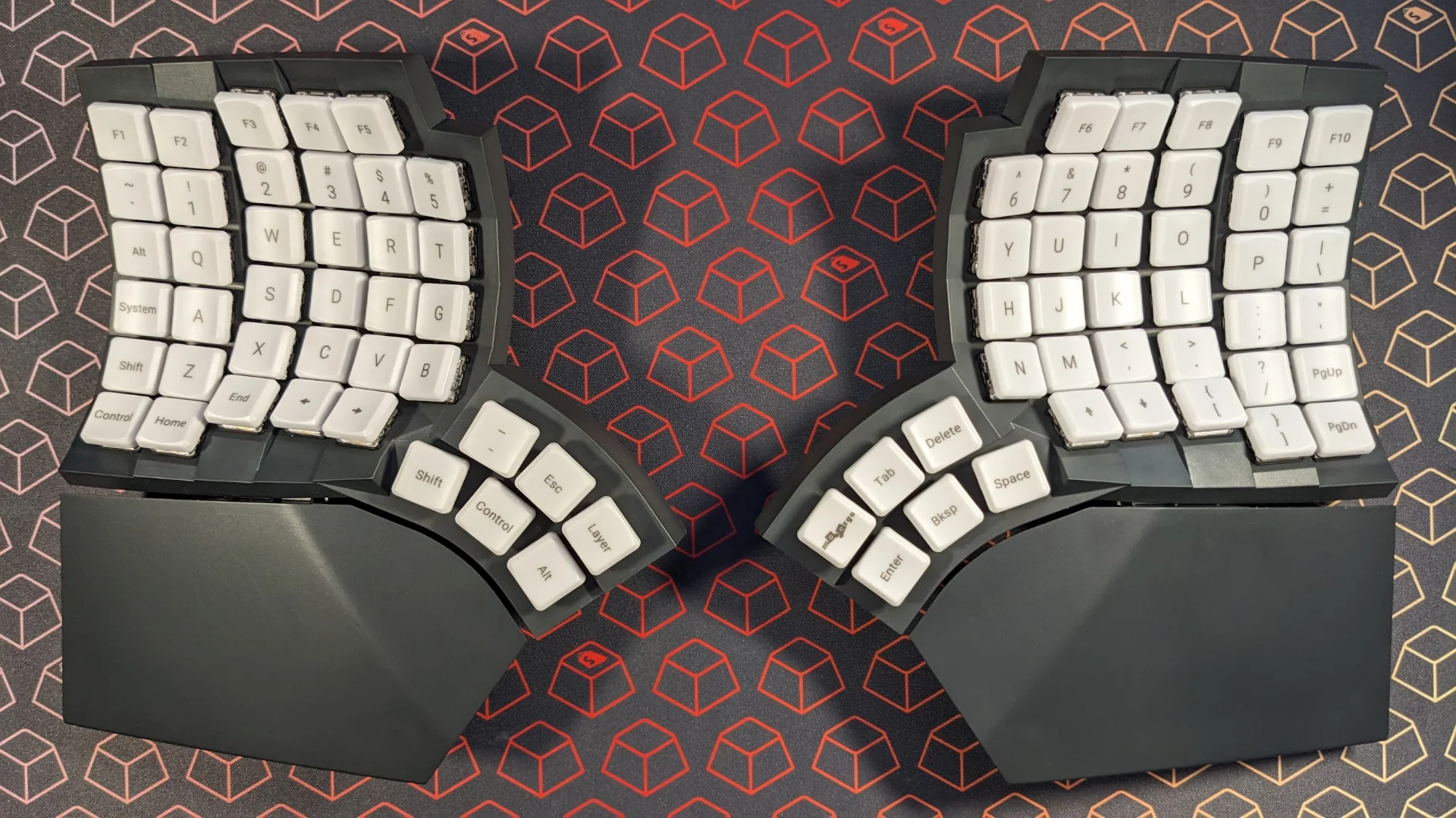
First impressions of the MoErgo Glove80 ergonomic keyboard
Table of contents
I never had any real interest at all in mechanical keyboards until recently. I mostly considered them a novelty; the kind of thing that was fine as a hobby, but not anything particularly practical.
Over the last year or so, however, I’ve been going deeper and deeper down the rabbit hole of mechanical keyboards, and I’ve discovered a much richer, more fulfilling world than I ever suspected. There’s just something about nerding out over the finest details of the machine you touch and use every day that can be extremely gratifying.
It was silly that I never looked any closer at things like keycaps and switches, I now realize. After all, a person who spends all day on their feet will likely care deeply about their shoes; why shouldn’t someone who logs thousands of keypresses a day be invested in how their fingers feel?
However, unlike most mechanical keyboard enthusiasts, I wasn’t initially drawn to the hobby by any interest in the feel, sound, look, or performance.
Instead, my gateway into mechanical keyboards was purely driven by the search for better ergonomics.
Backstory: my history with keyboards, ergonomics, and RSI
For most of my life, whatever keyboard was attached to or supplied with the computer I was using was just fine with me. I rarely gave any thought to the device resting beneath my fingertips.
Then came 2020, and the pandemic. The home became the workplace. Between the constant demands of remote work and desperate attempts at escapism, my laptop was pretty much always…well, on top of my lap. (And even when it wasn’t, it was probably on a surface that was in no way designed to be a comfortable workstation.)
Over these weeks and months, I developed a repetitive stress injury (RSI), and though I didn’t know it then, it would be my first of many. My right wrist, constantly pinched, was in ever-present and worsening pain, which was at times so bad I couldn’t even tighten my grip or carry heavy things.
It became clear I couldn’t keep going without making changes.
Over the first year of working from home, I ended up spending around $2,000 overhauling my home workstation to alleviate the pain and prevent new injuries.
(What a great system, that makes working most expensive for the people for whom it’s the most painful..)
I got a better chair, a standing desk, a wrist brace, and—finally—my first split keyboard: the Kinesis Freestyle2 for Mac.

That keyboard served me well for nearly two years; it got my hands further apart, and allowed my wrists to sit at a more natural angle. But it eventually led to another, different injury: my left thumb was constantly bending at uncomfortable angles to press the command key to initiate shortcuts.
That’s when I started looking at keyboards with thumb keys, and ended up with a ZSA Moonlander. I wrote about that story here.
At first, I hated the Moonlander. The ortholinear (columnar grid) layout took a lot of getting used to, but it paid off and felt amazing once I got it down. To learn was to love. I even went so far as to invest in a new set of switches and keycaps for the Moonlander, which made me love it even more.
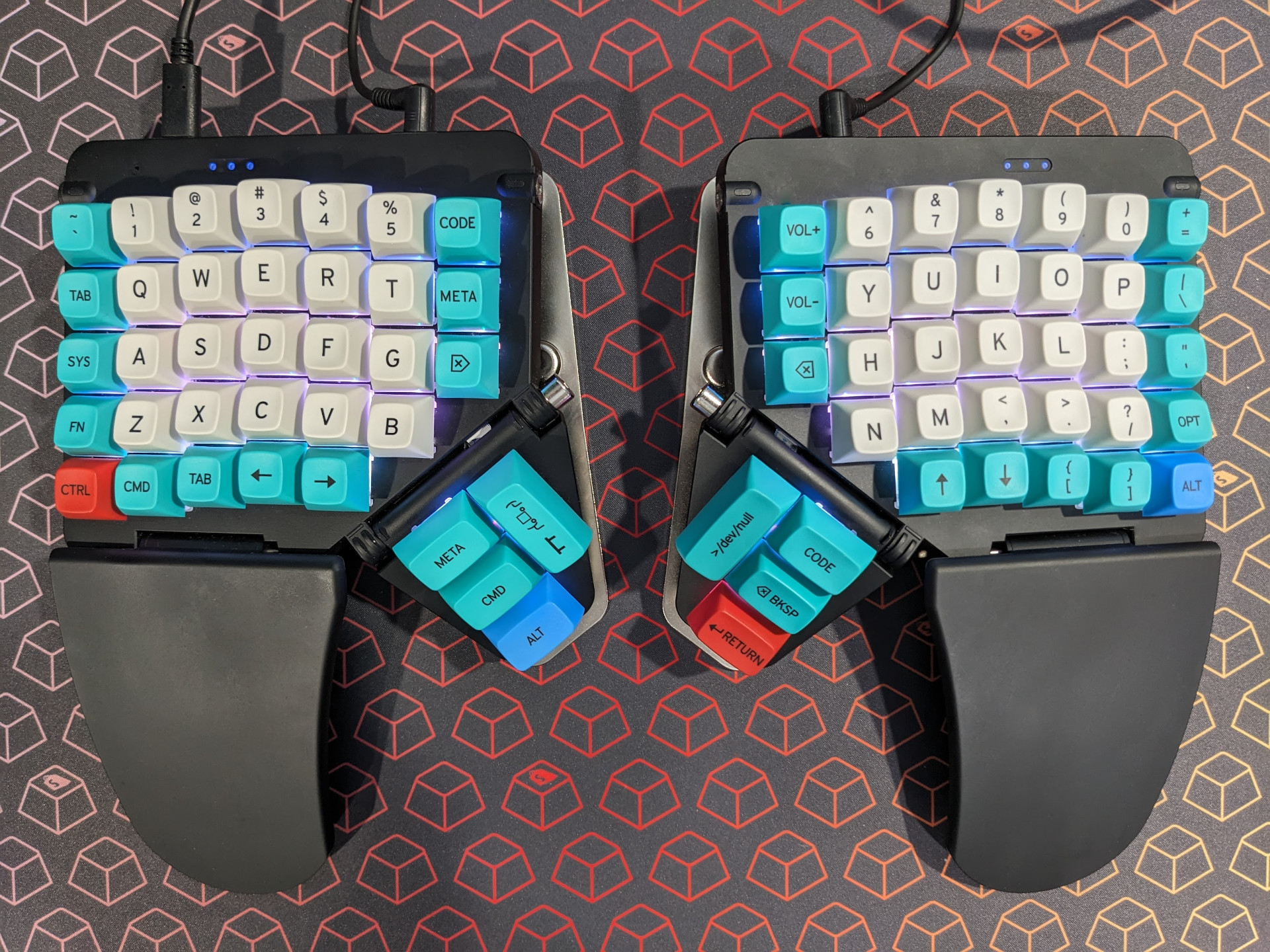
Over time, however, a new RSI flared up, even with the Moonlander.
As I write this, I’m still recovering from this latest injury. Some of it, I attribute to the Moonlander specifically; some is likely my own fault. Some probably isn’t even work-related.
I don’t think all my issues stemmed from working on a computer; I notice minor pain sometimes even from playing my Switch in handheld mode for extended periods, or from keeping my arm locked in place when driving long distances.
Still: I was adjusting the Moonlander a dozen times a day trying to figure out the problem. Turns out: it doesn’t really allow your hands to just rest when they’re not typing. (Or at least, it didn’t how I was using it, and certainly not without bending your wrists upward.) So over time, my left arm muscles fatigued from constant activation. I had to train myself to move my arm off the keyboard when not in use, since, again, there wasn’t any really comfortable way to just rest my hand (especially at higher tenting angles).
I’m not here to tell you the Moonlander is bad, or that it won’t work for you. However, I will say again: I think it’s a keyboard that wants to be cool first, and ergonomic second.
I initially thought the similar Ergodox EZ might solve my problems, with its thicker palm rests. However, the keyboard itself is so tall, it really wasn’t any different. And sadly, like the Moonlander, the Ergodox was a letdown in the range of customizations it offered.
Again, I should emphasize that despite valid criticisms of the Moonlander, some of my issues with it were of my own creation, and some probably weren’t even entirely work-related.
Ergonomics are highly personal, and everything you do in your day contributes. What works for one person might not work for another.
Still, even making all the adjustments I knew how to make—despite how much I loved the feel of it—I felt like there might be a better option for me than the Moonlander at this stage of my life and career. So again, beset by arm pain (this time in both wrists, as well as my left elbow), I set out to find a solution.
That’s when I started thinking maybe the Glove80 could be the fit I was looking for.
Why the Glove80?
Ergonomic keyboards cover an incredibly wide spectrum. On one end, they’re little more than standard keyboards with a few curves, a gap in the middle, and/or a palm rest added. (Microsoft’s Sculpt Ergonomic Desktop and Logitech’s K350 and Ergo K860 fit this bill.)
On the other end of the spectrum are devices that barely even resemble traditional keyboards. They’re often split (i.e., in two pieces, instead of one, allowing the wrists and forearms to sit straight in front of the shoulders instead of pointing awkwardly inwards together), and they frequently have a highly unconventional shape and layout.
Not all ergonomic keyboards are mechanical (or split, for that matter), but many are; ergonomic keyboards are often a sub-niche of the mechanical keyboard niche.
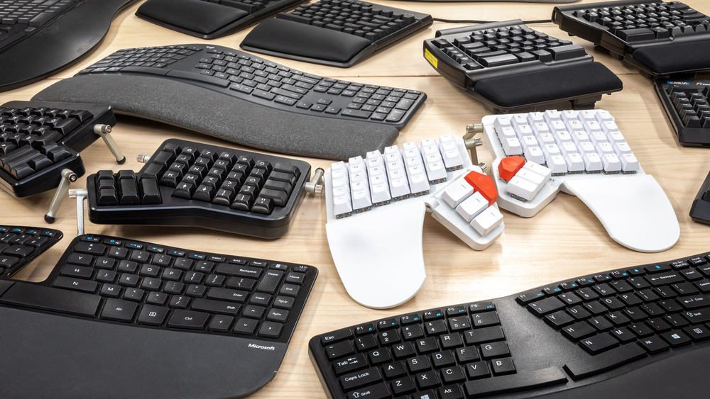
Even within the nested rabbit hole of ergonomic mechanical keyboards, however, neither the Glove80 nor its maker, a New Zealand company called MoErgo, are likely to be among the main names you’ve heard of. Generally, it seems like Kinesis and ZSA have the largest mindshare in the space (though there are others, like Cloud Nine, Dygma and UGL, maker of the UHK).
Nearly as I can tell, the MoErgo Glove80 is a dark horse—or at least, it was until recently. Just finding reviews for it was challenging. The designer in me can’t help but wonder how much of that may be due to MoErgo’s website design; their store has a pretty dated, somewhat amateurish look and feel. It’s definitely not a storefront that inspires confidence in the product, as far as aesthetics go.
So: why did I buy a relatively unknown keyboard from a comparatively small manufacturer with a highly questionable website?
Because I could tell they cared—maybe more than anyone—about actual ergonomics.
MoErgo clearly takes the Glove80 very seriously. Join the Discord, and you’ll find the founders fastidiously posting updates, and actively responding to questions and issues.
More impressive than that, though: MoErgo goes to great lengths to explain how and why they landed on the Glove80’s design, and that commitment shows. This doesn’t feel like a cool keyboard with “ergonomics” slapped on as an afterthought selling point, just because it can tent a little. [Side-eyes ZSA]
The Glove80 genuinely feels as though every decision was in service to ergonomics first and foremost, and everything else was secondary.
MoErgo designates a pretty hefty portion of its website and printed materials to telling the story of the Glove80’s design. It’s undeniably impressive; over 500 experiments and prototypes are laid out in detail. The journey of assumptions being made, challenged, rethought and re-challenged is a testament to the designers’ dedication to arriving at the best possible ergonomic solution.
With all that preamble out of the way, let’s get to the main course.
As I’m writing this, I’m almost a month into using the Glove80 as my full-time daily driver. I’ll wrap things up with a tidy list of pros and cons, but in the meantime, a lot of my observations really aren’t either (or, are both at the same time), and so I think I’ll take more of a scattershot approach to this post.
Options
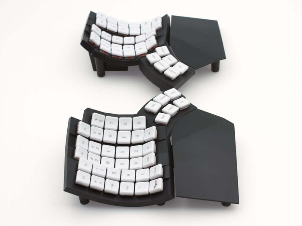
Compared to some other similar keyboards, the choices you’ll need to make when ordering a Glove80 are fairly minimal. Mainly, you only choose:
- Switches (covered in depth here); and
- Color; grey (basically black), or white
The keyboard comes with the palm rests already attached, but they can be removed if you prefer, for whatever reason. (They’re a big part of the package to me, so I don’t know why you’d want to, but maybe if you were mounting the keyboard you would.)
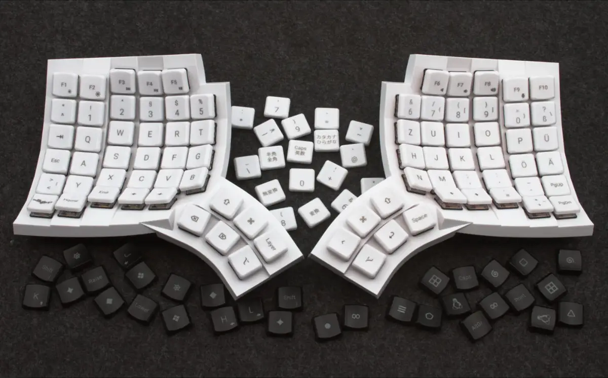
There’s also a version available with unsoldered switches, in case you’re mechanically minded and want to add your own, but most of us will probably just choose switches and color.
Worth noting: the keycaps (and included cable) will be white regardless of what color you choose for the body of the keyboard.
Pricing and shipping
Although the Glove80 is made by a New Zealand company, it ships from China. I initially thought this might mean shipping would be very slow and/or expensive. To my surprise, however, mine arrived in less than two weeks, and shipping was included in the price of the keyboard.
That price, I’ll note, is certainly far from trivial; the Glove80 will run you $399 USD. That’s undeniably hefty, but all things considered, it’s actually a pretty good price. Other manufacturers charge similar rates for comparable keyboards, but the Glove80 already includes several extras for which those other companies often charge extra.
It’s sadly common for supposedly ergonomic keyboards to only allow a minimal degree of tenting and/or tilting out of the box, but to offer a paid add-on to unlock more customization, which might run you over $100 all on its own. [Side-eyes ZSA again]
Wireless connectivity, if offered, can also be an upcharge. You might also pay for RGB lighting, or for certain customization options. In many cases, even the palm rests run an extra $30–80.
So while $399 USD might seem steep, know that unlike with most similar keyboards, that’s the full and final price; no up-sells or add-ons.
Another credit to MoErgo: unbeknownst to me at the time, I ordered my Glove80 just before the new version of the keyboard began shipping. (It’s not significantly different; it mostly just features minor construction improvements, and now comes with a few extra accessories and a travel case.) MoErgo put the old stock on sale for $20 off, about a week after my order.
Total bummer for me, since I would’ve either got the newer package, or paid $20 less, if I’d only waited a little longer. But to the company’s credit, they took the initiative to automatically issue a $20 gift card and to everybody else in the same situation.
Plus, that travel case now comes included with all new Glove80s at no extra cost. All of this speaks very highly of the folks running the show and what their priorities are. You get the sense that MoErgo is willing to invest profits to make people happier, and that’s one of the best things you can say about a company, if you ask me.
Layout customization
Like many keyboard manufacturers, MoErgo has their own layout editor app, available at my.glove80.com. This is where you go to make changes to your layout; when you’re done, you download a config file, and upload it to your keyboard.
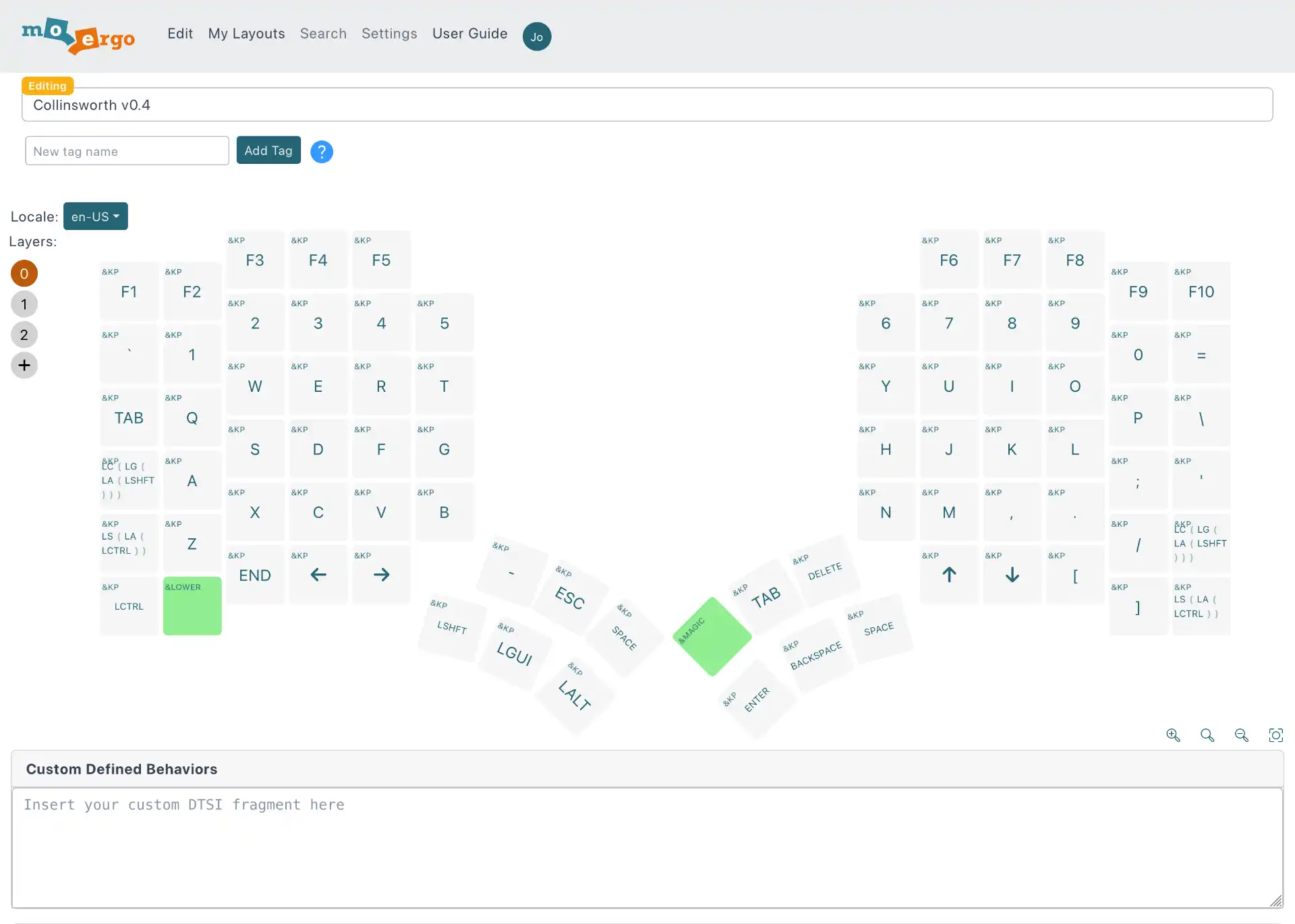
Under the hood, this app uses open-source ZMK software for customization. The keyboard ships with three layers: layer 0 (the default), layer 1, and the “magic” layer, which is triggered by the conspicuous MoErgo logo key, and which holds most of the hardware controls, like lights and Bluetooth. You have the ability to add more layers, if desired.
In keyboard terms, a layer is a mapping of keys; a layer determines what each key does when pressed.
For example: when you’re on the default layer, pressing the “a” key will simply type an “a” character. But on another layer, you could remap the “a” key to anything you want; arrows, symbols, or even complex key combos or macros.
I haven’t used a lot of keyboard customization software; mainly jut ZSA’s Oryx, so that’s my only real point of reference. MoErgo’s app is similar and simple, at least for fairly standard things. Adding a complex modifier like hyper (cmd + opt + shift + ctrl) is a little more involved; you have to add each individual modifier separately, making this example a four-step process. It would be nice to have a single button for those instead, but that’s a minor quibble.
I notice the editor is fairly straightforward; while you can customize key presses in a pretty wide variety of ways, you can’t do much besides customizing keys.
That is, with Oryx, there’s a wide range of keyboard options, too. I didn’t use most of them, but one I did particularly like was autoshift, which lets you long-press a key instead of shift-pressing, which I find handy. It’s nice to just press the “a” key for slightly longer to get an uppercase “A,” (or, [ to get {), rather than getting another finger involved—especially when you’re still learning your layout or when it’s a physical stretch.
Autoshift alone is easy enough to add with Karabiner-Elements, so it’s still enabled. I prefer it that way, actually; it lets me use autoshift even when using the built-in laptop keyboard.
Anyway, though it’s less full-featured than Oryx, the layout editor works great for customizing keys. But if you want to go any deeper than that, you’ll likely have to write your own code. (There’s a box for you to put your own custom code into in the editor, with a strong “make sure you know what you’re doing” caveat.) Fine, and probably even better for some power users, but I’ll likely never touch it if it’s not in the GUI, and I’m guessing a lot of users won’t either.
One noticeable pain point: when modifying your layout, you’re required to flash each side of the keyboard separately.
With the Moonlander and Ergodox EZ, just uploading your layout once did the trick. Here, once you have your customization file downloaded from the customizer app, you’ll need to upload the config file to each one.
I’ve been told that as long as all you’re doing is changing the key mappings, you should be able to get away with only uploading the layout to the left half. However, I was warned against this by the manufacturer.
Plus, uploading a new layout file requires putting the keyboard into bootloader mode, which is a little tedious in and of itself.
With the Moonlander and Ergodox, you just hit a tiny physical button on the board itself. Here, however, you have to either designate a special bootloader key in your layout (not difficult, but remember, you’ll need one on each half of the board); or, hold down a special key combo when powering on the keyboard half (a little like holding shift while powering on your computer to boot it in safe mode). You can find these combos in the instruction booklet.
This isn’t a particularly big pain point for me, personally, since I’ve already got my preferred layout pretty well dialed-in. But I remember when I started learning the Moonlander, I would often modify my layout multiple times a day, and that sort of on-the-fly experimentation would hit some strong friction here.
In fairness, having a bootloader key available, instead of being forced to use a teensy pinhole button, might be considered a benefit. That’s fair enough, but it brings up another quibble: if you have a bootloader key, you might hit it accidentally.
There’s a key that resets Bluetooth that I hit mistakenly once, even though it was buried in the special Magic layer (I was trying to toggle the LEDs, incidentally). I was forced to pair my keyboard all over again. No big deal, but it’s a potential hazard.
This section has gotten pretty long with various quibbles and minor issues. None of them are substantial on their own, but they stack up to make using this keyboard a fairly daunting affair.
The level of technical know-how required to use and modify the Glove80 makes it pretty hard to recommend to beginners or casual users.
Even customizing the layout might be tricky for non-tech-savvy folks—especially knowing how easy it is to accidentally mess something up and be forced to go digging through the troubleshooting FAQ.
That said, I gather both MoErgo’s customizer and the ZMK software it’s built on are actively developed software with planned future improvements. So maybe the Glove80 will become a bit more friendly to casual users as time goes on. (Of course, you don’t have to customize the layout, or use layers.)
Lights
While the Glove80 does have RGB lights under each key, the lighting seems a little less full-featured than comparable keyboards. While you can customize the color, every key has to be the same color; you can’t customize per-key or per-layout.
This is apparently a limitation of ZMK (for now, at least), but there are hacks to work around it. I haven’t looked into them, but regardless, that’s fairly technical “you better know what you’re doing” territory.
In any case, though: I wouldn’t say the lights are a major selling point here. They’re neat. They can look pretty cool in the dark. But they accelerate battery usage when in wireless mode, and there are only a few lighting options to choose from anyway.
There’s a nice rainbow animation that slides across all the keys (my personal favorite, pictured below). If you’re not using that animation, again, every key has to be the same color, but you can choose whether they stay lit, gradually pulse off and on, or rotate through hues in sync all together. Hue, saturation, and animation speed can all be adjusted, at least.
By the way, the lights are toggled and adjusted using the keys on the Magic layer, rather than in the layout editor. (And, of course, you can just leave the lights off.)
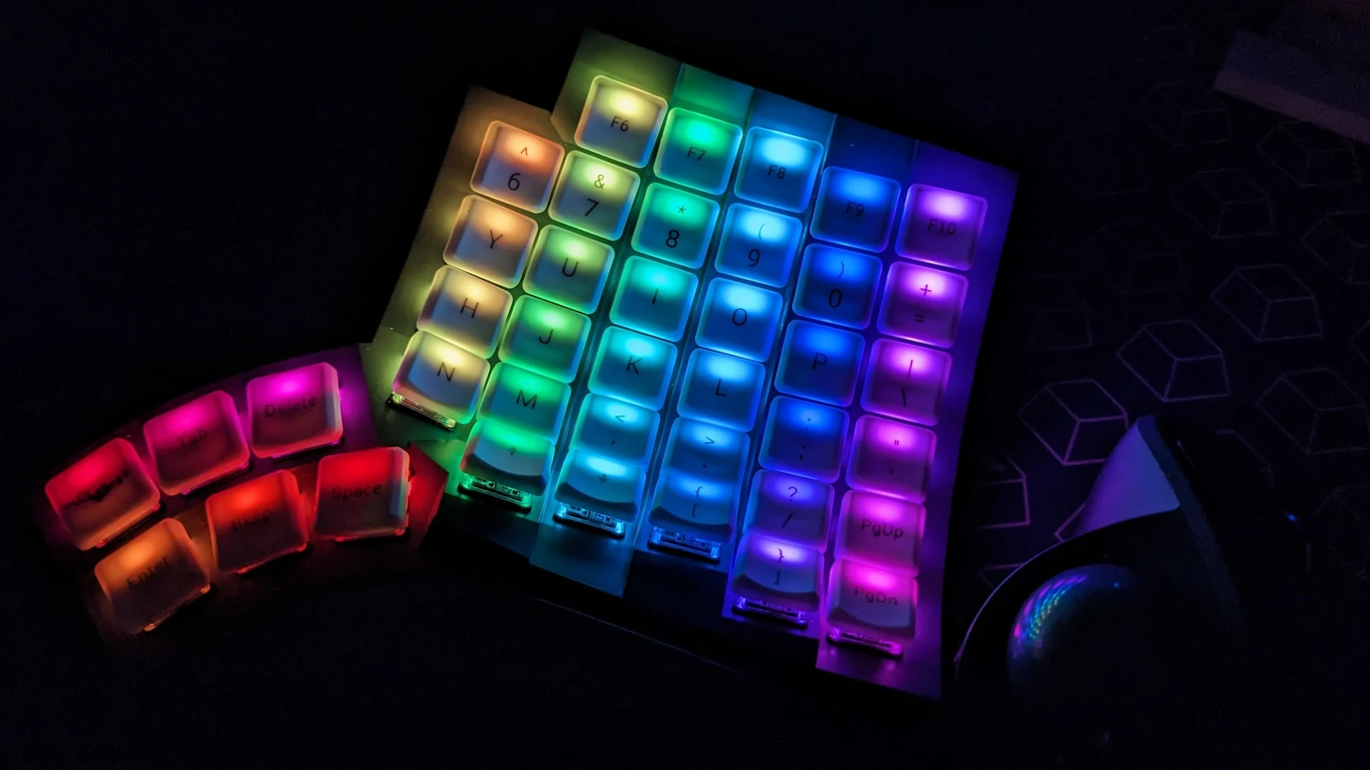
I personally wouldn’t have missed the lights—or at least, wouldn’t have minded if they were just there to provide a little light in the dark and didn’t have all the customization options. Still, they’re a nice-to-have.
One other note on the topic of lights, though: MoErgo cleverly decided to use the RGB lights as a status indicator. When you tap the Magic layer key (the one with the MoErgo logo), the left half illuminates to show the battery level of each side of the keyboard, which layer is currently active, key lock status, and Bluetooth profile info.
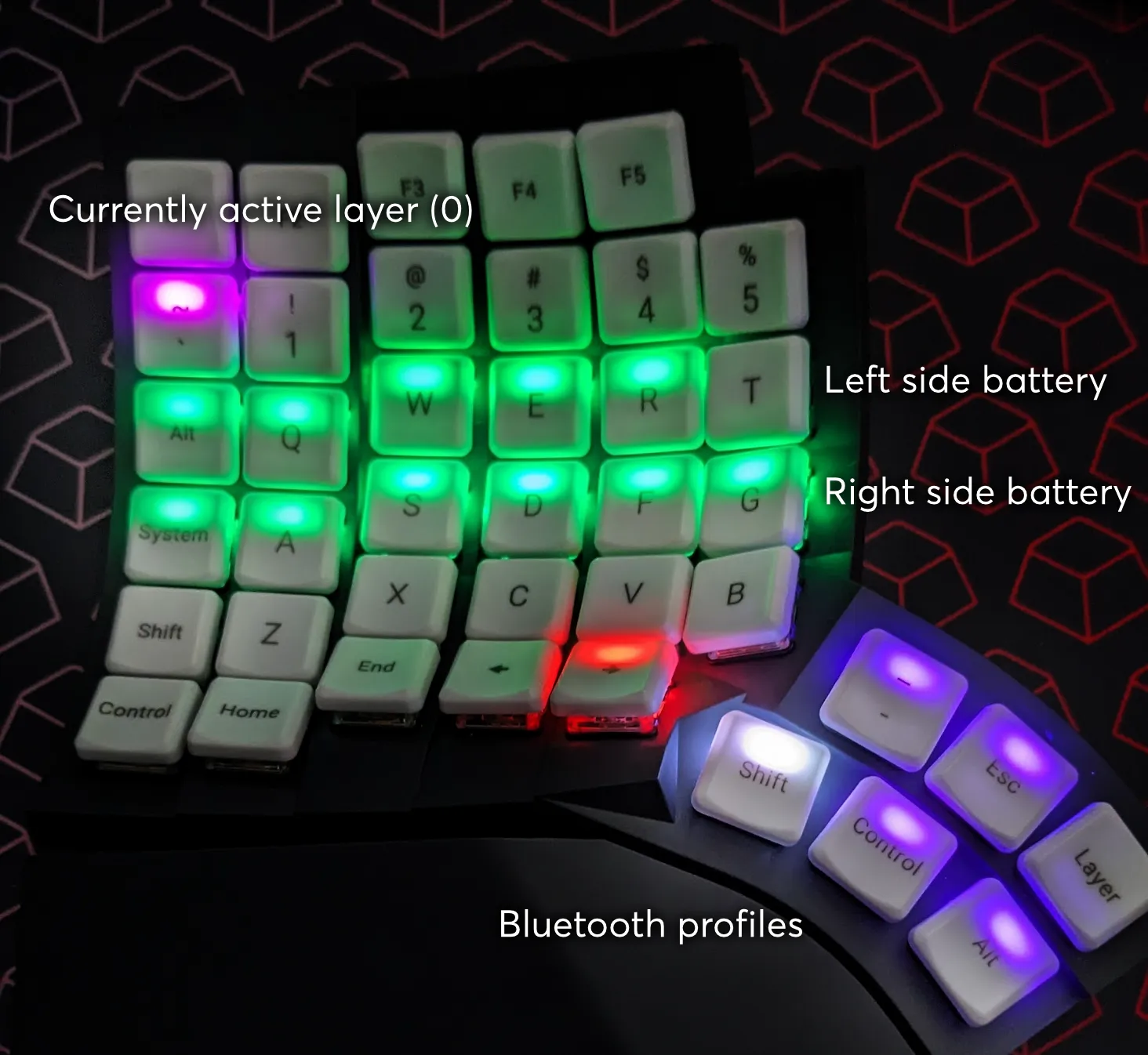
It’s a clever workaround that lets you access that information without the need for any additional software. (Come to think of it: I didn’t need to install anything to start using the Glove80, which is nice.)
Wireless and battery
The wireless connectivity has mostly worked very well for me. Only the left half connects to your host machine via Bluetooth; the right half then just connects with the left.
There have been a couple of instances where the halves lost connection with each other and I needed to do some troubleshooting to get them reconnected, but I’m fairly certain those were both my fault. They both happened while I was still learning how to change the layout, and it hasn’t happened since. In any case, re-flashing the right half was all it took to set things right again, so no big deal.
Connection-wise, the Glove80 offers multiple Bluetooth profiles, represented by the six thumb keys in the photo above. You can toggle between using Magic layer keys. This lets you connect to multiple devices, and switch between them without the need to disconnect or re-pair; you can just hit the proper key for the device you’re using.
In my limited testing (switching between two MacBooks), this feature works even better than I expected. In my experience, Bluetooth is finicky on its own, and doubly so where Macbooks are involved, so I didn’t expect toggling between machines to work seamlessly or on the first try, but that’s exactly what happened.
If you plan to use the Glove80 wirelessly with multiple devices, I’m happy to report this feature seems to work excellently.
On to power. With the comparable keyboards I’ve used, just one half needed to be powered by the host, and the other half is connected to that one via a connector cable. With the Glove80, however, both halves are independently powered with a USB-C port.
This is both a pro and a con. It’s nice that there’s no wire running between the halves, and that each can be independently positioned wherever you like, however close or far from the other half. (I often set my phone and other objects between the halves of my split, so that’s convenient.)
However, it’s a con because it means you’ll need to keep an eye on the power of both halves. That said, though, the battery life seems to be very good.
I’ve used my Glove80 in wireless mode almost the entire time I’ve had it, and the battery lasts easily a good couple of weeks or more.
It seems like the left half tends to drain a little faster than the right (which makes sense, since it’s the “brain”). Still, as of this update, it’s been at least 10 full days since I last powered down or charged either half, and they’re both reading at over 50% battery.
Worth noting: I use the Glove80 full-time during my workday, but don’t usually use it on evenings or weekends. I also haven’t had the RGB LEDs active in that time period; I’m sure the lights would accelerate battery use.
Each half has an independent power button, which is just a small springy nub of a switch that feels a little on the cheap side. However, since the keyboard automatically sleeps when not in use, in practice, I’ve rarely had a reason to turn either side off.
In fact, I left my keyboard on while I was out of town for over a week, and didn’t notice any significant battery drain when I returned.
So all in all: high marks for battery.
Ergonomics and customization
I guess this is the section that matters, so maybe I kinda buried the lede here.
The Glove80 feels fantastic. I find myself placing my hands on it just to feel it whenever I walk through the room. That’s now nice it feels.
I’m resisting the urge to use the phrase “fits like a glove,” but it really does.
MoErgo recommends using the keyboard in its fully “flat” default position while getting used to it, before making any tenting or tilting adjustments. I’ve mostly done this, and I’ve found the result to be generally very pleasant. I truly thought I needed tenting, but at this point in my ergonomic journey, at least, maybe I actually needed a really good palm rest that kept my wrists at a neutral angle.
Tenting is the degree to which the keyboard slopes from the lower left and right edges up towards the center; tilting is the degree to which the whole board slopes towards or away from your body.
Most all ergonomic keyboards try to optimize these form factors; many allow you to customize one or both yourself.
It should be noted that MoErgo sees the Glove80 as a kind of spiritual successor to the Kinesis Advantage; a sort of raised “platform” for your hands with a scooped-out key well for each set of fingers.

For many years, the Advantage was one of the only really innovative ergonomic keyboards on the market, and it seems the MoErgo makers were fans. But while it was perhaps revolutionary for its time (its layout appears to have inspired the current generation of ortholinear keyboards), it left room for improvement and iteration.
I’ve never used a raised keyboard before, but I found the adjustment surprisingly minimal. However, that’s with the strong caveat that I’ve already put my time in with ortholinear boards; I can touch type with them quite well at this point. I’m sure the learning curve would’ve been exponentially higher if this had been my first ortholinear keyboard.
If you’ve never taken the time to learn touch typing—typing without looking, using the proper fingers for each key—I’d highly recommend it, regardless of your chosen keyboard. It’s likely that my shoddy ad-hoc typing form contributed to my RSI.
One of the main ergonomic goals of the Glove80 seems to be keeping your wrists in as much of a natural position as possible. That is: not bent at all, in any direction; an extension of your forearm.
To achieve this with a raised keyboard MoErgo opted for low-profile switches and keys (Kailh Choc v1, specifically—more on the switches and keycaps in another section).
What this means is: while the keys on the Glove80 are noticeably taller than those on an Apple laptop or the Apple keyboard, they’re still also significantly shorter than any standard (mechanical) keyboard. The home row sits at a little less than an inch above the desk surface.
It should be noted that some ergonomics-minded folks don’t like raised keyboards, since the scooped key wells mean your hands have to sit higher above the desk surface. This in turn means the optimal desk height with a raised keyboard will be lower than it would be with a standard keyboard, to accommodate the difference in height. (In the case of the Glove80, this is probably a matter of only about 1–1.5 inches, depending on your own adjustments.)
This isn’t an issue for me, with my adjustable Uplift desk legs. But that said: I do find myself pushing the desk to its lowest possible point more now than I did before. If your work surface doesn’t adjust—or isn’t very low—you might have issues that I didn’t.
All that out of the way:
I notice the angle of my wrist is dramatically lessened with the Glove80. Between the short switches and the lower key bed, I’d estimate my fingertips rest a full 1–2 inches lower.
I actually pulled out my Moonlander after using the Glove80 for a while, and I noticed my wrists bend upward much more severely with the former than with the latter. (I wanted to switch to the Moonlander for a bit, just to enjoy my old switches and keycaps, but after feeling how suboptimal its palm rest is, I sadly just put it back in its case. Maybe another day.)
Many reviewers have commented how easy it is to slide your fingers up and down the columns of keys, and I’ve also had this experience. Gliding up or down from the home row is so easy I often find myself overshooting.
Which reminds me: many reviewers also comment that the Glove80 works well for folks with smaller hands. My hands are pretty average size for an adult male (about 7.5 inches from my wrist to the tip of my middle finger), but I can confirm that I can reach any key without any issue, though the function keys are a slight stretch.
Again: sometimes I even overreach, just because the keys are nestled so nicely together. But that’s just an adjustment; it’s actually very nice being able to hit keys two rows above the home row so easily.
The thumb keys, too, are close enough together that even reaching the furthest ones isn’t an issue (though I wouldn’t recommend putting keys you use with high frequency at the furthest reaches of the thumb clusters).
You might notice that each column of the keyboard is scooped at a little different depth, creating vertical trenches to accommodate each individual finger’s length. (i.e., the keys you’ll be hitting with your middle finger are in the deepest well; those you’ll press with your pinky, the shallowest.)
That might look funky or intimidating, but honestly, it hasn’t been an issue in my experience. If anything, it’s kind of helpful; one of my more petty gripes with the Glove80 is that it doesn’t include homing keys. (You can buy them, but not printed; they’re just blank, which is a bummer.) On other boards, I rely on homing keys to make sure my fingers are in the proper position without looking, but here, thanks to those individually scooped finger trenches, if you’re off the mark, you’ll probably realize it right away.
Anyway, all that to say: so far I’ve been very pleased with the feel and ergonomics, though I haven’t customized tenting or tilting too far just yet.
Speaking of that, though: the Glove80 has five adjustable feet on the bottom of each side. Each individual foot can be adjusted by tightening or loosening the screw to create the desired angle. (The sixth foot, on the outer middle, is not adjustable, as it doesn’t really need to be.)
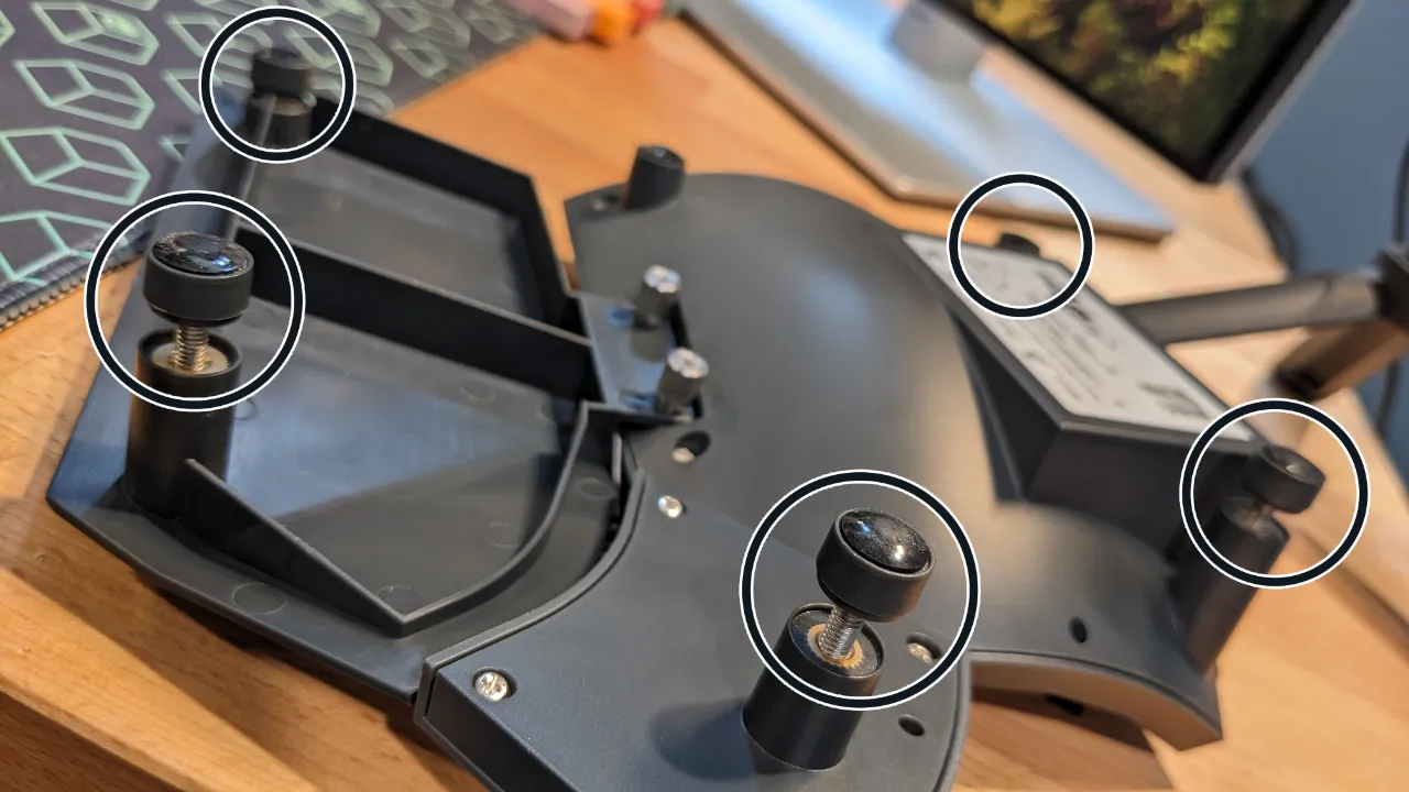
The Glove80 also includes an array of extra hardware to augment the customization capabilities (along with a keycap puller). These extra extensions let you create some more extreme tenting and/or tilting angles than what’s available with the default feet.
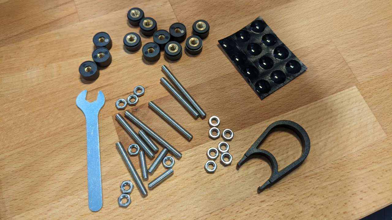
Again, here we find both upside and downside in the same package. There’s a massive range of possibility here—much greater than any other keyboard I’ve tried. The included hardware is a nice touch, and it’s stuff you could go out and buy at a hardware store if the situation called for it. I appreciate this means both affordability and flexibility.
On the other hand, though, it means adjustments are a bit more labor-intensive than with most other keyboards. Hard to complain about too much, since I can’t say any keyboard I’ve tried has come close to the Glove80’s adaptability (and I’m not sure how you’d make this easier anyway). Still, it’s worth noting that adjustments will be just a little more fiddly here.
Regardless, for now, I haven’t felt the need to utilize the added hardware, as the capabilities of the standard feet have suited my needs thus far. (And again: MoErgo recommends getting used to the keyboard in standard, flat profile for a few weeks before experimenting with customization, just to set a baseline.)
Did it solve my issues?
Since I started this post off by talking about the RSI issues that led me to try the Glove80 in the first place, I should probably address the question of how much it’s helped with those issues.
I’d love to say the keyboard solved all my problems, but while I think it has helped, it’s also not that simple. Truthfully: while my condition now is much better than it was when I was shopping, I’m not exactly sure what to attribute to the hardware, and what to attribute to other life changes.
Like any physical issue, the cause of RSI is often complex and multi-faceted. So just changing one thing, keyboard or otherwise, isn’t likely to fix things all on its own.
My situation was already beginning to improve before the Glove80 arrived, thanks to the arm and wrist exercises I’d been doing regularly. So it’s tough to say what’s the keyboard, and what’s just me, being more mindful and diligent.
That said: I absolutely love the palm rest on this keyboard. It’s just plastic, of course, but its positioning feels as supportive and comfortable as I wished all my other keyboards’ palm rests were. My hands feel as though they’re in a very comfortable position, and the Glove80 seems as though it can accommodate any adjustments I might decide I need in the future.
And, for what it’s worth: since using the Glove80, I really haven’t had any issues in either wrist. I even think it might be helping my elbow, although I’m not 100% sure that was ever totally a work thing, and it’s too soon to tell anyway.
I can say this, though: the last several weeks, I’ve felt my wrists and arms wear down as the week went on. I’d rest and recuperate on the weekend, not touching a computer the whole time, and then start all over the following week.
This past Friday was the first in weeks, maybe months, where I actually felt fine, and I wasn’t straining my arms and wrists just to get through the last day of the week. Plus, I don’t remember the last time I felt like I needed to do a full stretching routine.
That’s saying something. But is it all due to the Glove80? Probably not. At the same time, though, I doubt I’d be writing that last bit if it weren’t for the new keyboard, either.
I wasn’t a firm believer at first. (Earlier drafts of this post weren’t this positive in this section.) But I’m telling you…when you get your desk and arm rests dialed in with those palm rests on the keyboard, it’s a magical feeling.
Granted, other keyboards have solved my issues before, too, before eventually creating new ones. So I’ll be sticking with the Glove80 for the foreseeable future to see if it can both exorcise old demons and ward off new ones. The strongest signals will only emerge with time, and I may revisit this post (or write a new one) as I learn more.
Switches and keycaps
The switches on the Glove80 are low-profile Choc v1 switches, and unfortunately, they are not hot-swappable; they’re soldered in place.
There’s a good reason for this drawback, though: apparently, when the keys are as close together as the Glove80’s are—and when they sit at angles, rather than uniformly flat—swappable switches are much riskier to the quality and consistency of the keyboard. Soldering the switches in place essentially means a better product.
Besides, there aren’t very many Choc v1 switches to choose from anyway. The Glove80 ships with your choice of four switches (kinda three): Brown, White, Red, and Red Pro.
For traditional reasons, key switches are usually referred to by color names. The various colors refer to a specific combination of sound and feel. For example: blue switches are generally loud and clicky.
Any given switch from one manufacturer should be similar to the same color from another manufacturer, in keeping with the convention. But the actual colors themselves don’t mean anything, outside being a shorthand.
The Red and Red Pro are both linear switches, which means they don’t have any bump or clickiness to them; they just go straight down silently when you press them, kind of like a spring. (I personally can’t stand linear switches; I like to feel my keypresses register. But they work better for some people.) The Red Pro version requires less force to press, so it might be nice if you have weak fingers or RSI that gets in the way of applying force. (It’s called “pro” because, in theory, you can press these switches milliseconds faster, making them ostensibly ideal for gaming. I find these claims dubious, but then again, linear switches aren’t for me anyway.)
The Browns and Whites appear to be identical from the tech specs, except that the Whites make a clicking sound when pressed, and the Browns do not. Both are tactile switches, which means you feel a bump when you press them.
I opted for Brown switches on my board, and as expected, they feel quite a bit like Cherry Browns, despite a lower travel distance. (If that doesn’t mean anything to you, don’t worry. It just means the keys have a modest bump and are moderately springy, and while they do make a little bit of sound, they aren’t loud or clicky.)
The Brown switches are fine, but the keyboard enthusiast in me wishes there was an option with a little more oomph. I used Glorious Pandas on my Moonlander and absolutely loved them. I still haven’t fully gotten used to the softer feel of the browns yet.
In any case, the narrow range of choices isn’t MoErgo’s fault; nearly as I can tell, there just aren’t any other Kailh Choc v1 switches on the market. At least you still have a choice of linear, tactile, or clicky.
As for the keycaps: the caps included with the Glove80 appear to be opaque white at first glance, but when you activate the RGB LEDs, their translucency becomes apparent, and you can see the light shining through from below.
If you’re the modding sort, know that Choc v1 keycaps seem to be much harder to find than standard Cherry-compatible keycaps. This is probably largely because Choc v1 uses its own stem (generally just referred to as Choc), which looks a bit like a two-prong electrical plug, instead of the de facto industry standard Cherry “plus” stem.
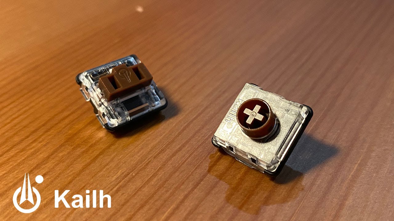
MoErgo made this decision deliberately, however; they seem to feel that Choc v2 switches, despite wider compatibility, only really manage to be the worst of both worlds.
Turns out, not all Cherry-compatible keycaps are actually compatible with low profile switches, even if they use the same stem. (Most such caps were designed assuming the space a standard switch would provide, which can mean collisions when mixing low-profile switches with standard caps.) When the keys are so close together and angled towards each other, as on the Glove80, you might not have the space for standard keycaps anyway.
Choc v2 switches are also marginally taller than Choc v1, so they represent a small but meaningful change to ergonomics. All that makes Choc v2 good in theory, but suboptimal in practice (in this use case, at least), and so MoErgo chose once again to optimize for fit over compatibility, which I see as a good thing.
Still, again: it can be very challenging to find Choc keycaps. They’re a small fraction the popularity of Cherry. MoErgo sells a few add-on packs, but they’re not much. A lot of popular keycap manufacturers don’t even offer Choc sets, but some do.
Summary
The Glove80 is definitely the most ergonomics-minded keyboard I’ve ever touched. You feel that every design decision was focused on optimizing comfort for as many hands as possible.
It’s unfortunate that it’s limited in terms of switches and keycaps, and that it’s a little more technical than some of its contemporaries. But all things considered, I’m very happy with my investment here, and I think this is a keyboard I’ll continue to use for a very long time.
I’ve assembled a final pros and cons list, if you’re just looking for the tl;dr on the lengthy ramblings above. Most of the cons are things not everyone would care about (and/or that are only important to keyboard nerds such as myself). So while I certainly can find a number of nits to pick, nits they remain. This is overall a very good value.
(Also worth noting: it’s entirely possible some of the items on the “cons” list change over time as the software receives further updates.)
Pros and cons
Pro:
- Good value for price; lots included
- Feels great
- Broad range of adjustments
- Good wireless connection and battery life
- Likely to be comfortable for a wide range of hand types
- Relatively low profile for a raised keyboard
- Lightweight; travels easily
Con:
- Moderately expensive
- Limited selection of switches and keycaps
- Not as easy to customize as some comparable models
- Limited and unimpressive lighting